My City Explore App
Creating a meaningful user experience
The goal of this project was to practice and learn more about UX processes starting from research to end all on my own without the UX Research team. Going through all other stages like brainstorming, prototyping, ideating, testing with users, etc. It was the individual project that I did on my own.

Project Overview Description
Whenever we go to a new city, we highly depend on the internet. Social media these days or to friends. But in many cases, the authentication of the data is still in doubt. Here platform like ‘My city explores’ comes into play which plays a significant role in valid and up-to-date information about the city.
My Role
- Problem statement framing
- UX Research
- Persona
- Final Product
My Role
- Problem statement framing
- UX Research
- Persona
- Final Product
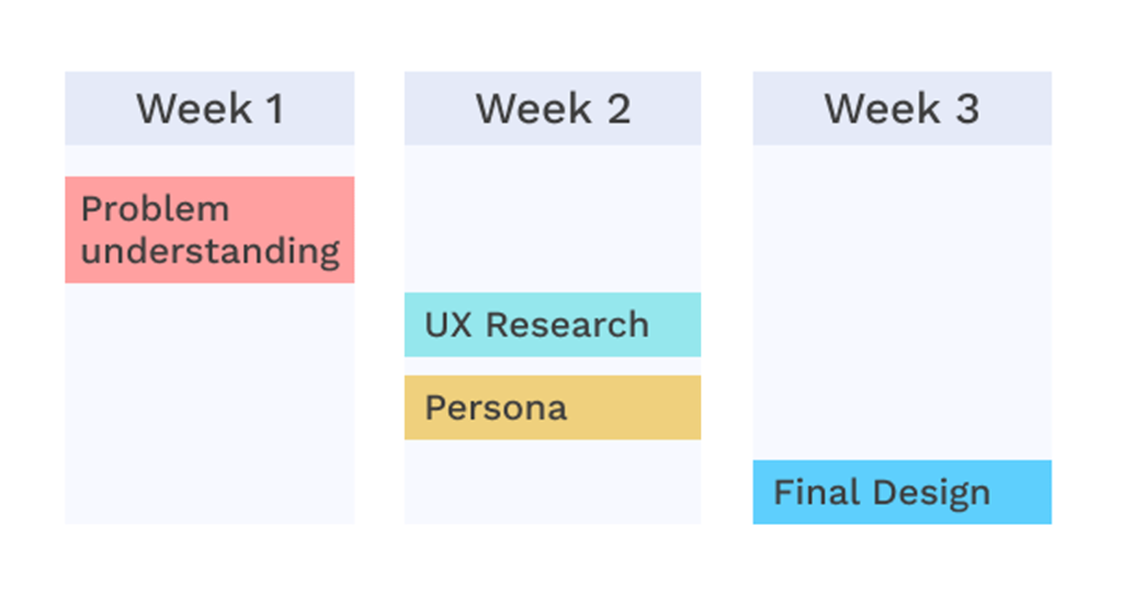
Project Timeline
What is the need for the ‘My city explore’?
Problem statement
Creating a one-stop platform for travelers providing them with all the necessary information which they will need to explore cities
Defining the problem
Thanks to the interviews, I’ve found the same pain-points that both adventurers experience:
- Keeping all this information organized on one platform.
- Find recommended routes and have the ability to customize them.
- It takes too much time to find information to plan the trip.
- They have difficulty determining the travel time and distance from point to point.s
User Interviews
Traveling at least one time a year become a norm nowadays, to escape daily life, learn about new countries, people are constantly searching for a new unique destination. Although there are hundreds of apps that make travelers’ life easier. I wanted to focus on travel guides and travel recommendations, so I prepared some questions related to this topic for the interview.
I used the unstructured interview approach to find out more about travelers’ preferences, motivations and expectations.
Here are some questions that I asked during the interview
- What motivates you to visit a certain places?
- What do you prefer to do during the trip?
- Do you prefer to travel alone or with a company?
- Do you prefer packages deal or book everything individually?
- How often do you travel in year?
- Do you plan a trip beforehand?
- Where do you look for the information to plan your trip?
Here is my finding
There are 4 types of travelers, Single travelers, Travelers with kids, Couples and group/friends. I’m going to focus on couples and single travelers because I’ve interviewed these types. These people plan their trip ahead.
Some are spontaneous travelers that like to discover on the go.
72% prefer to plan their trip ahead, they look at Instagram / TikTok, Ask friend and family, Google & Travel Vlog and blog.
Travelers may do a lot of research to plan their visit depending on where they go.
User persona pain-point
- Spend too much time gathering relevant information.
- Creating a doc or taking screenshits of places they wanna visite.
- Found planning things a little tiring
- Rating in the website are really old many times
- Dont have any fix time to make plans
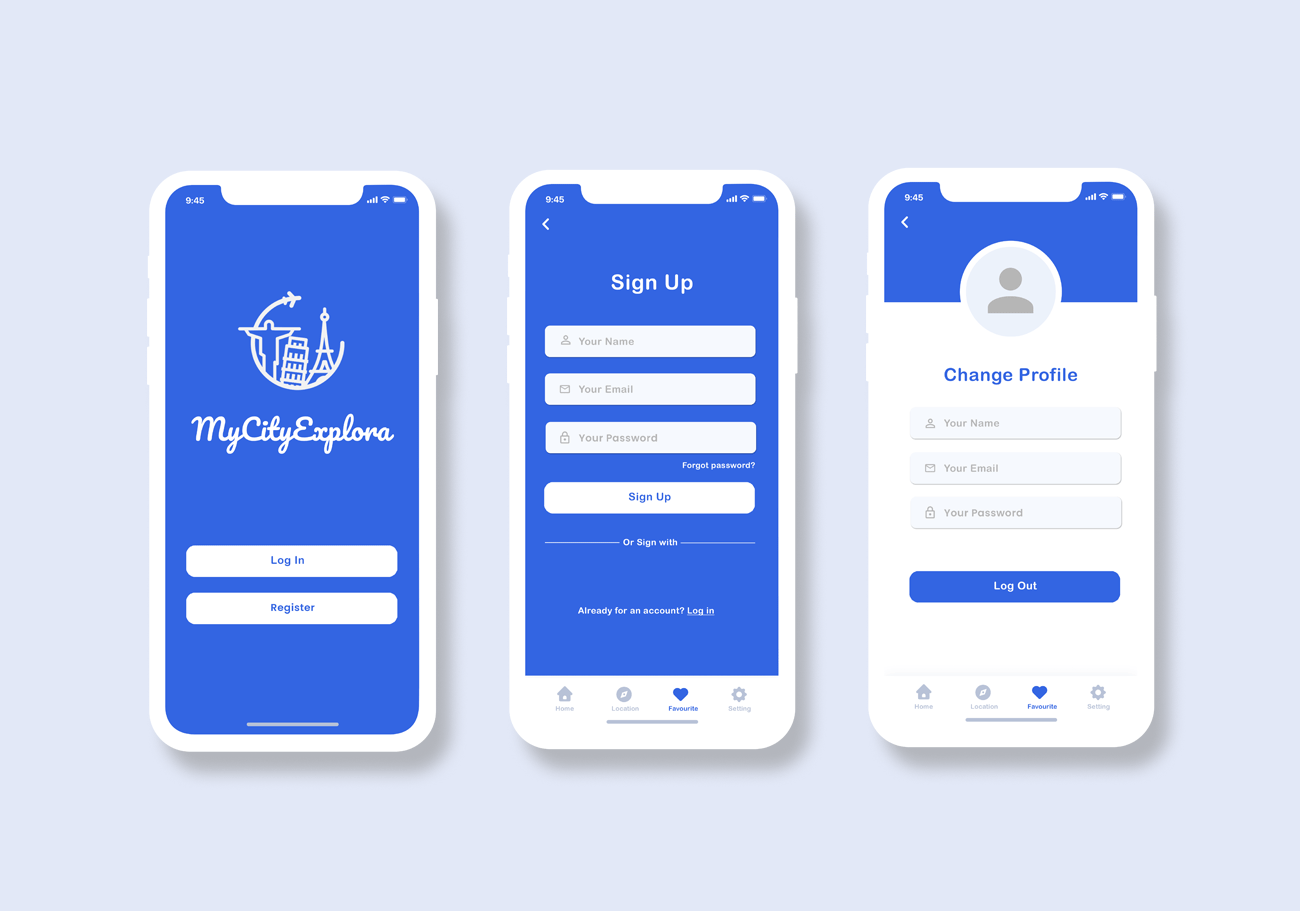
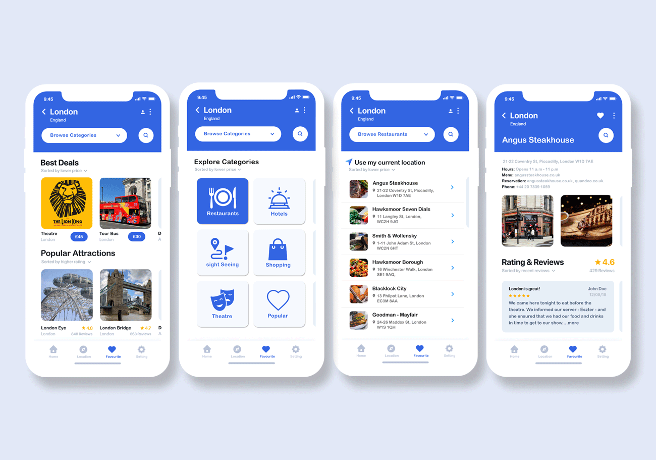
After researching and creating personas, I iterated the final designs.
Pleasure Points
- Accommodation and transformation details are helpful.
- Get all information related to my place in one place.
- Google map and directions to places
- Miximum saving of time spent on scheduling
Sketches
Once I analyzed the pain and key focus points, i sketched out what the “settings” and “Menu” will look like since majority of the solutions will be placed under them.
Wireframes
- I also spent some time choosing colors and typography.
- I decided to go with a bright blue color to enhance the primary actions (blue associates with a clear sky and water holiday feel high preference as to color) and also I added several variations of a dark and light grey for users to comfortably read big parts of a text.
- Regarding fonds, I tried to find a few options for users to read articles and process content easily. I decided to stick to PT Serif for smaller text and Fira Sans for titles and subtitles.
Final Iterations
Working on the final prototype, I took into consideration all the user feedback that I got during testing and develope several screens where travelers can choose the destination and places that they want to visit.
Category
PortfolioDate
17th May 2022
